Understanding Metallic Maps in PBR Workflows
The metallic map answers one fundamental question about every point on your surface: is this metal or not? It sounds simple — and the map itself is just black and white — but understanding what that distinction actually means physically is what separates convincing PBR materials from ones that look slightly off no matter how much you tweak them.
What is the Metallic Map?
The metallic map is a grayscale texture that defines which parts of a surface are made of metal and which are not. It's one half of the PBR Metal/Roughness workflow — the other being the roughness map — and together they give the PBR shader all the information it needs to calculate physically accurate reflectance for any material.
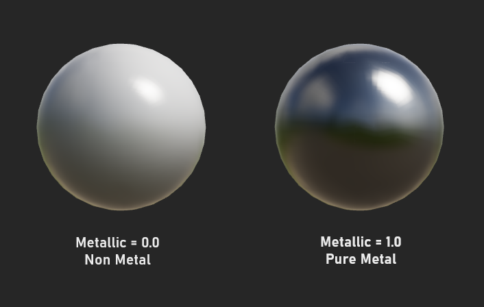
The values are intentionally binary in real-world terms. Black (0.0) means non-metal — dielectrics like plastic, wood, stone, skin, fabric, paint. White (1.0) means pure metal — iron, gold, copper, aluminium, chrome. In practice, most surfaces on any given asset will be fully one or the other, with only transitions between materials sitting in the grey zone.
Metals vs Non-Metals — The Physics
The reason PBR makes such a sharp distinction between metals and non-metals is that they interact with light in fundamentally different ways. Understanding the physics — even at a basic level — makes working with the metallic map much more intuitive.
⬛ Non-metals (Dielectrics)
Light partially reflects off the surface and partially passes through into the material. The portion that enters gets scattered and re-emitted as the albedo color. Specular highlights are always white (or very slightly tinted). Both reflection and diffuse color are present simultaneously.
⬜ Metals (Conductors)
Light reflects almost entirely off the surface. Almost nothing passes through into the material. There is no diffuse component — metals have no albedo in the traditional sense. Specular reflections take on the color of the metal itself (gold reflects yellow, copper reflects orange).
This is why in PBR, the albedo map behaves differently depending on the metallic value. For a non-metal, the albedo is the surface's diffuse color. For a metal, the albedo defines the color of the specular reflections — which is why raw iron has a grey albedo, gold has a warm yellow albedo, and copper has an orange-red albedo.
How the Metallic Value Changes Shading
Setting a surface to metallic changes three distinct things about how it's shaded:
| Shading Property | Non-Metal (Metallic = 0) | Metal (Metallic = 1) |
|---|---|---|
| Diffuse component | Present — light scatters through material and re-emits as albedo color | Absent — no light penetrates the surface, no diffuse color |
| Specular color | Always white (or near-white) regardless of albedo color | Tinted — takes on the color defined in the albedo map |
| Specular intensity | Low — only 4–8% of light reflects at normal incidence | High — 60–100% of light reflects, varies by metal type |
| Fresnel effect | Strong — reflectivity increases dramatically at grazing angles | Weaker — already highly reflective at all angles |
| Appearance in dark | Shows albedo color even without specular light | Appears near-black without an environment to reflect |
Real World Metal Albedo Values
For metals, the albedo map encodes the reflectance color — the tint of the metal's specular reflection. These are the physically measured reflectance colors for common metals. Using values close to these produces the most convincing results in PBR:
Common Metallic Map Mistakes
These are the mistakes that most consistently produce non-physical-looking results when working with metallic maps:
Using grey metallic values everywhere
Intermediate metallic values (0.3, 0.5, 0.7) don't correspond to real materials. Real surfaces are either conductors or dielectrics. Use grey only at material transition edges — rust over iron, paint flaking off metal.
Dark albedo on metals
A metal albedo should be bright. A dark grey albedo on a metal produces a dull, lifeless surface. Iron isn't black — it's a medium-bright grey. Use measured values wherever possible.
Colored albedo on non-metals with metallic = 0
This is fine! Non-metals can have any albedo color. The mistake is thinking metallic controls shininess — it doesn't. Use roughness to control shine on non-metals.
Forgetting metallic affects albedo interpretation
Setting metallic to 1.0 on a brightly colored albedo won't produce a colorful metal — it produces an incorrect non-physical material. Metal albedo should match the metal's known reflectance color.
Painting Metallic Maps in Practice
Because metallic maps are mostly binary — black or white — painting them is less about subtle gradients and more about precise masking. The most interesting metallic map work happens at transitions between metal and non-metal areas.
Most mechanical props are a mix of metal components and non-metal elements (rubber grips, plastic covers, painted surfaces). Map metallic precisely to each material region.
Rust is a non-metal. Areas of rust on iron should drop the metallic value to 0 and raise roughness dramatically. This transition — metal to rust — is one of the most visually interesting uses of the metallic map.
Paint is a non-metal coating. Set metallic to 0 on painted areas. Where paint has chipped away and bare metal shows, raise metallic to 1.0. Curvature maps make this easy to mask.
A gun, armor piece, or vehicle is never just one material. Careful metallic masking that distinguishes metal parts from rubber, leather, and plastic creates much more realistic results.
At the border between a metal and non-metal region, a 2–4 pixel feathered edge on the metallic map prevents harsh, artificial-looking transitions in the final render.
Baked curvature maps are ideal for driving paint-chip effects on metallic maps. White curvature (convex edges) drives where paint wears through to bare metal underneath.